24 Hours of London's Tweets Visualised
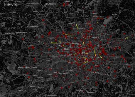
This is a fantastic visualisation of 24 hours' worth of tweets across London. It's a great video - and choice material for social media presentations, I'd wager - that brings to life the way information is shared across a geography.
The red dots are the tweets, with the yellow streaks showing the direction of a retweet (RT) from the origin to the destination. Of course, this is just a fraction of the actual volume as most people don't have geolocation turned on.
The gold star for this goes to Dr Anders Johansson (@afjohansson) at the Centre for Advanced Spatial Analysis, University College London. From a quick peruse of his research, there's some interesting work at UCL that worth keeping an eye on.
Hat tip: LikeCool.com

1 April 2011 by Sam Michel

Sam Michel is the founder of Chinwag and blogs here for work, and more randomly at Toodlepip. He runs Chinwag Jobs, Digital Mission and tends to focus on murky place where technology, community and marketing collide. You'll find him on twitter @toodlepip.
Sam Michel is the founder of Chinwag and blogs here for work, and more randomly at Toodlepip. He runs Chinwag Jobs, Digital Mission and tends to focus on murky place where technology, community and marketing collide. You'll find him on twitter @toodlepip.