The Facebook Friend Map of the World
Q: What happens when you let an intern loose with 10m lines of data and some processing power?
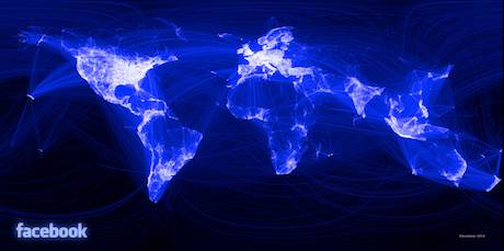
A: In the case of Paul Butler an intern with Facebook's data infrastructure engineering team, something rather special.
The above image is a data visualisation that he created by mapping 10m friend connections between Facebook users. The colour of the line ranges on a scale of dark blue to white depending on the volume of connections.
The kicker? The details isn't overlayed onto a map, this is purely driven by the data,
"What really struck me, though, was knowing that the lines didn't represent coasts or rivers or political borders, but real human relationships. Each line might represent a friendship made while travelling, a family member abroad, or an old college friend pulled away by the various forces of life."
Full details and the mahoosive 3.8Mb full-sized version is available in this Facebook note (naturally).
Hat tip: @socialmediaweek

14 December 2010 by Sam Michel

Sam Michel is the founder of Chinwag and blogs here for work, and more randomly at Toodlepip. He runs Chinwag Jobs, Digital Mission and tends to focus on murky place where technology, community and marketing collide. You'll find him on twitter @toodlepip.
Sam Michel is the founder of Chinwag and blogs here for work, and more randomly at Toodlepip. He runs Chinwag Jobs, Digital Mission and tends to focus on murky place where technology, community and marketing collide. You'll find him on twitter @toodlepip.